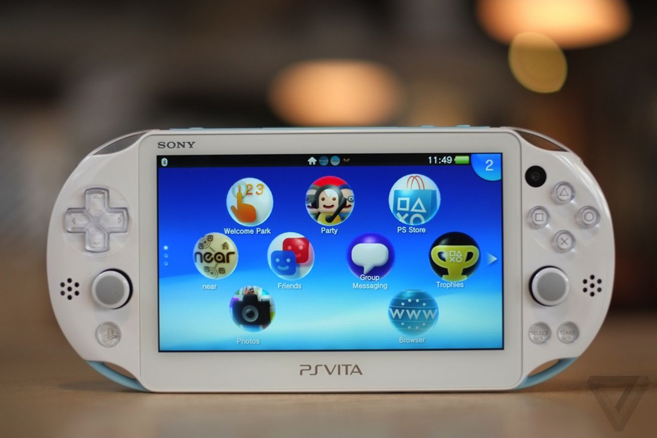
Every couple of weeks, I exhume my gadget graveyard from underneath my bed. I look at my iPods, old phones, and some other stuff. Most of it doesn’t stir me anymore, but the PS Vita is another story. It’s the device that I pull out most frequently, charging it up to, well, just to feel like it’s a part of the modern world.
I keep mine in a svelte Waterfield Designs soft case that cleans off fingerprints when it goes in so that it’s smudge-free when I pull it out, revealing design details that I apparently have an unshakable affinity to seeing over and over: gorgeous translucent shoulder buttons; the big (but not too big) display; and the sturdy yet elegant build quality. Almost everything going on with the look and feel of the Vita is...
https://ift.tt/5BdQ7JZ